

弊社から新しいサービス「リクルートマスター」がリリースされました!
詳細は『人が集まる採用サイトが手軽に作れるサービス「リクルートマスター」リリース』をお読みいただきたいのですが、こちらの紹介記事ではCSSアニメーションでグラデーションが変化するボタンを使用しています。
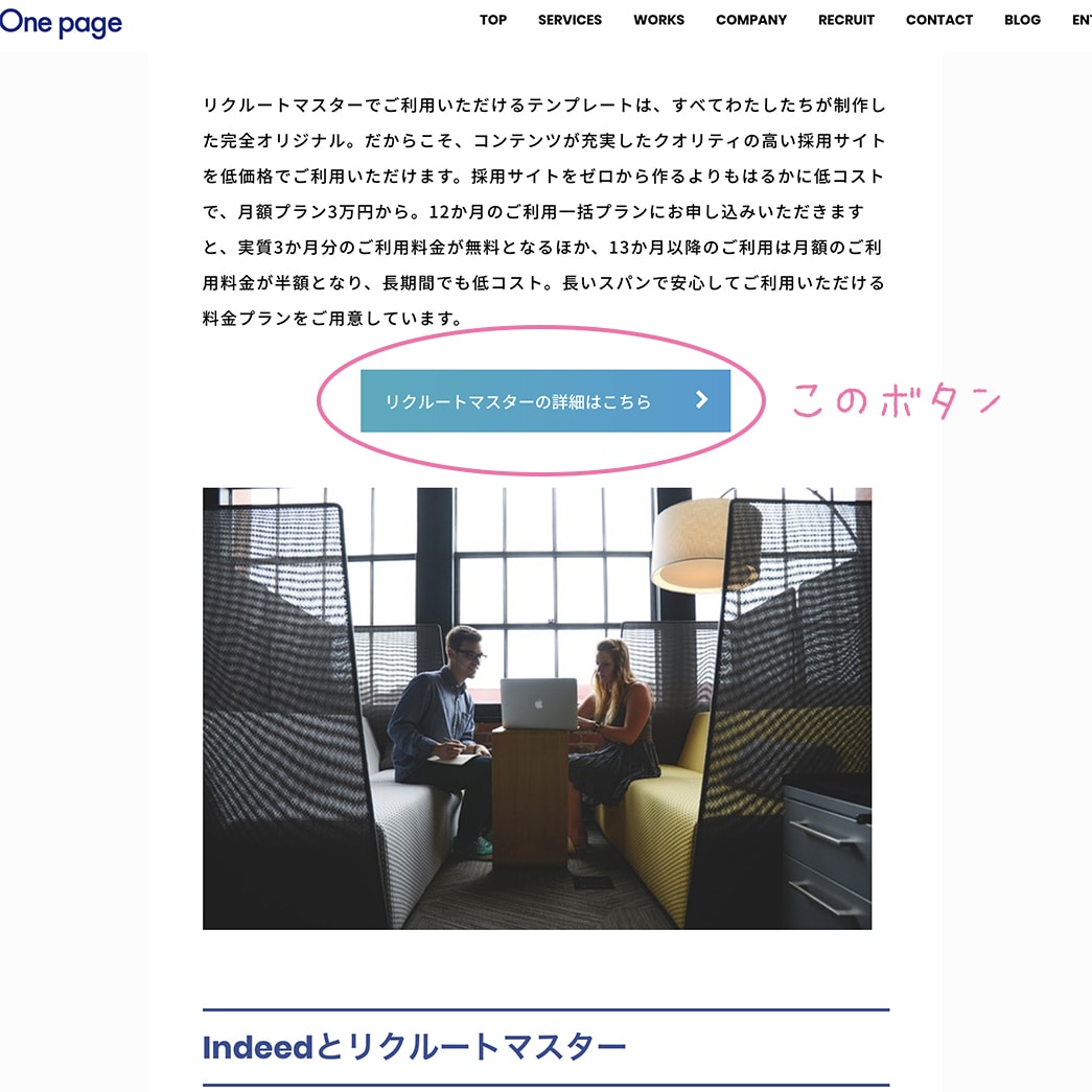
今回はこちらのような動くグラデーションボタンのサンプルコードをご紹介いたします。
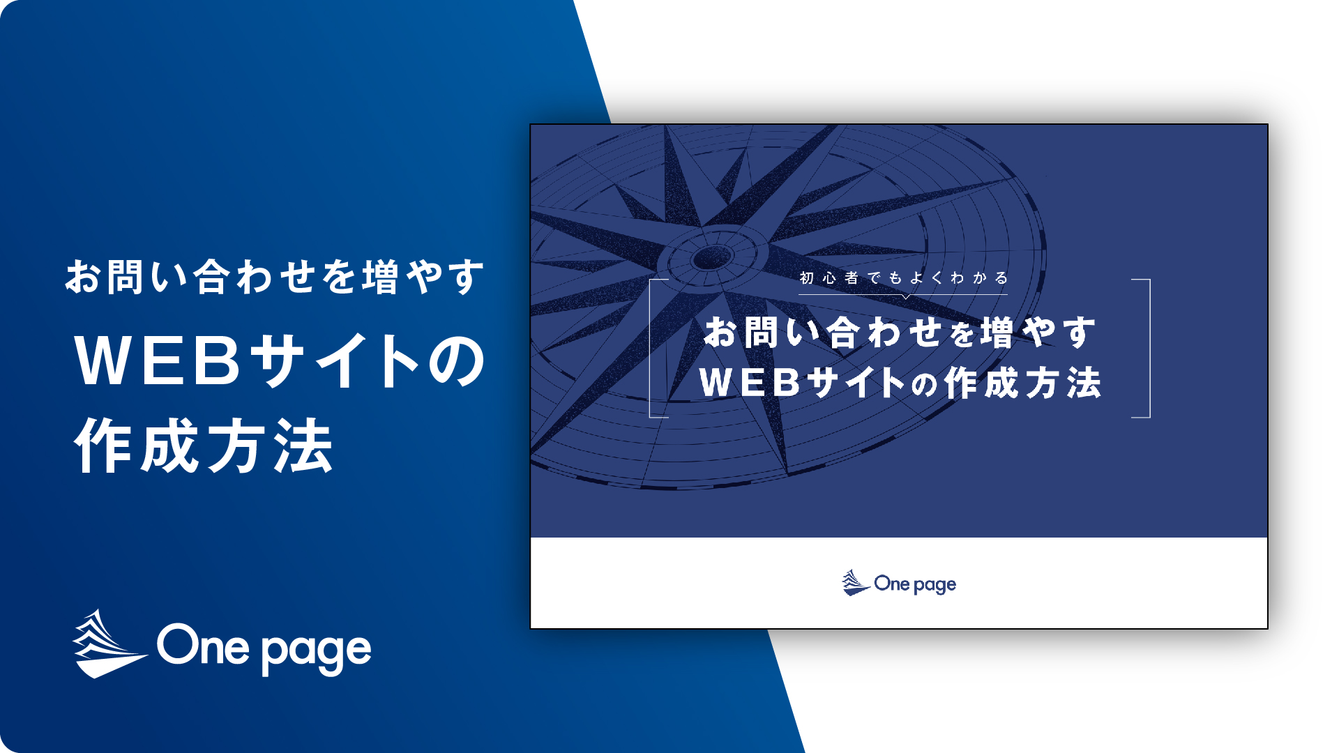
【無料お役立ち資料】
お問い合わせを増やすWEBサイトの作成方法
資料内容
- WEBサイト作成の流れと説明
- 各フェーズでの重要ポイント
- 問い合わせを増やすための最終チェックリスト
- 制作後の運用方法
- 制作の進め方と注意すべき点
サイト制作を依頼する際に知っておくべき内容になっていますのでぜひ無料でご覧ください。
この記事の内容
ピンク系グラデーション
ピンク系のグラデーションです。マウスオーバーで記号が動きます。
まずはhtmlから。
HTML
<button class="btn_pink">ピンクのボタン</button>そして、こちらがCSSです。
CSS
.btn_pink {
	position: relative;
	display: inline-block;
	padding: .5em 2.5em .5em 1.5em;
	border: none;
	border-radius: .25em;
	color: #fff;
	background: linear-gradient(270deg, #ff9a9e, #fad0c4, #ffd3d5, #fecfef);
	background-size: 400% 400%;
	-webkit-animation: gradientAnm 20s ease infinite;
	animation: gradientAnm 20s ease infinite;
}
@-webkit-keyframes gradientAnm {
 0% {
background-position:0% 50%
}
 50% {
background-position:100% 50%
}
 100% {
background-position:0% 50%
}
}
@keyframes gradientAnm {
 0% {
background-position:0% 50%
}
 50% {
background-position:100% 50%
}
 100% {
background-position:0% 50%
}
}
.btn_pink::after {
	position: absolute;
	top: 0;
	bottom: 0;
	right: 0;
	padding-top: inherit;
	padding-bottom: inherit;
	width: 2.5em;
	content: ">";
	font-size: 1.2em;
	text-align: center;
}
.btn_pink:hover::after {
	-webkit-animation: bounceR .4s alternate ease infinite;
	animation: bounceR .4s alternate ease infinite;
}
@-webkit-keyframes bounceR {
from {
-webkit-transform:translateX(0)
}
to {
-webkit-transform:translateX(4px)
}
}
@keyframes bounceR {
from {
transform:translateX(0)
}
to {
transform:translateX(4px)
}
}
ブルー系のボタン
htmlはクラス名が違うだけになります。
HTML
<button class="btn_blue">ブルーのボタン</button>CSSはこちら。
CSS
.btn_blue {
	position: relative;
	display: inline-block;
	padding: .5em 2.5em .5em 1.5em;
	border: none;
	border-radius: .25em;
	color: #fff;
	background: linear-gradient(135deg, #a1c4fd, #c2e9fb, #48c6ef, #6f86d6);
	background-size: 400% 400%;
	-webkit-animation: gradientAnm 20s ease infinite;
	animation: gradientAnm 20s ease infinite;
}
@-webkit-keyframes gradientAnm {
 0% {
background-position:0% 50%
}
 50% {
background-position:100% 50%
}
 100% {
background-position:0% 50%
}
}
@keyframes gradientAnm {
 0% {
background-position:0% 50%
}
 50% {
background-position:100% 50%
}
 100% {
background-position:0% 50%
}
}
.btn_blue::after {
	position: absolute;
	top: 0;
	bottom: 0;
	right: 0;
	padding-top: inherit;
	padding-bottom: inherit;
	width: 2.5em;
	content: ">";
	font-size: 1.2em;
	text-align: center;
}
.btn_blue:hover::after {
	-webkit-animation: bounceR .4s alternate ease infinite;
	animation: bounceR .4s alternate ease infinite;
}
@-webkit-keyframes bounceR {
from {
-webkit-transform:translateX(0)
}
to {
-webkit-transform:translateX(4px)
}
}
@keyframes bounceR {
from {
transform:translateX(0)
}
to {
transform:translateX(4px)
}
}
虹色のボタン
最後にレインボーカラーのボタンです。読みやすくするため、文字には影をつけています。
htmlはブルー系のボタン同様、クラス名のみ異なります。
HTML
CSSがこちら。<button class="btn_rainbow">虹色のボタン</button> CSS
background: linear-gradientの部分を変えるとアレンジが可能です。.btn_rainbow {
position: relative;
display: inline-block;
padding: .5em 2.5em .5em 1.5em;
border: none;
border-radius: .25em;
color: #fff;
text-shadow: 0 1px 1px #666;
background: linear-gradient(-45deg, #62b8e7, #53c5a0, #fff26b, #ffa06b, #f68aa3, #956eb6);
background-size: 400% 400%;
-webkit-animation: gradientAnm 90s ease infinite;
animation: gradientAnm 90s ease infinite;
}
@-webkit-keyframes gradientAnm {
0% {
background-position:0% 50%
}
50% {
background-position:100% 50%
}
100% {
background-position:0% 50%
}
}
@keyframes gradientAnm {
0% {
background-position:0% 50%
}
50% {
background-position:100% 50%
}
100% {
background-position:0% 50%
}
}
.btn_rainbow::after {
position: absolute;
top: 0;
bottom: 0;
right: 0;
padding-top: inherit;
padding-bottom: inherit;
width: 2.5em;
content: ">";
font-size: 1.2em;
text-align: center;
}
.btn_rainbow:hover::after {
-webkit-animation: bounceR .4s alternate ease infinite;
animation: bounceR .4s alternate ease infinite;
}
@-webkit-keyframes bounceR {
from {
-webkit-transform:translateX(0)
}
to {
-webkit-transform:translateX(4px)
}
}
@keyframes bounceR {
from {
transform:translateX(0)
}
to {
transform:translateX(4px)
}
}
また、今回はコピペで使いやすいよう、文字の後ろに自動でつく記号は不等号(>)にしましたが、FontAwesomeなどのWebフォントを読み込んでいる場合は、content: “>”の部分を変更していただくことで任意の記号がつくように変更できます。いろいろと試してみてください!
【無料お役立ち資料】
初心者でもよくわかるお問い合わせを増やすWEBサイトの作成方法
資料内容
- WEBサイト作成の流れと説明
- 各フェーズでの重要ポイント
- 問い合わせを増やすための最終チェックリスト
- 制作後の運用方法
- 制作の進め方と注意すべき点
サイト制作を依頼する際に知っておくべき内容になっていますのでぜひ無料でご覧ください。